See what I did there? Yep, the hackneyed old swap-the-title-to-represent-the-swap gag. Today's post is the reverse of the last; a few photos showing a gold Hero 616 cap fitted with a chrome clip.
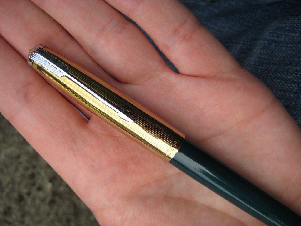 |
| Ka-bling! Even with the clouds overhead, this combo is so shiny photography is a challenge. | |
|
 |
| There's shine, and then there's glare. The 616 is glaring at me. |
|
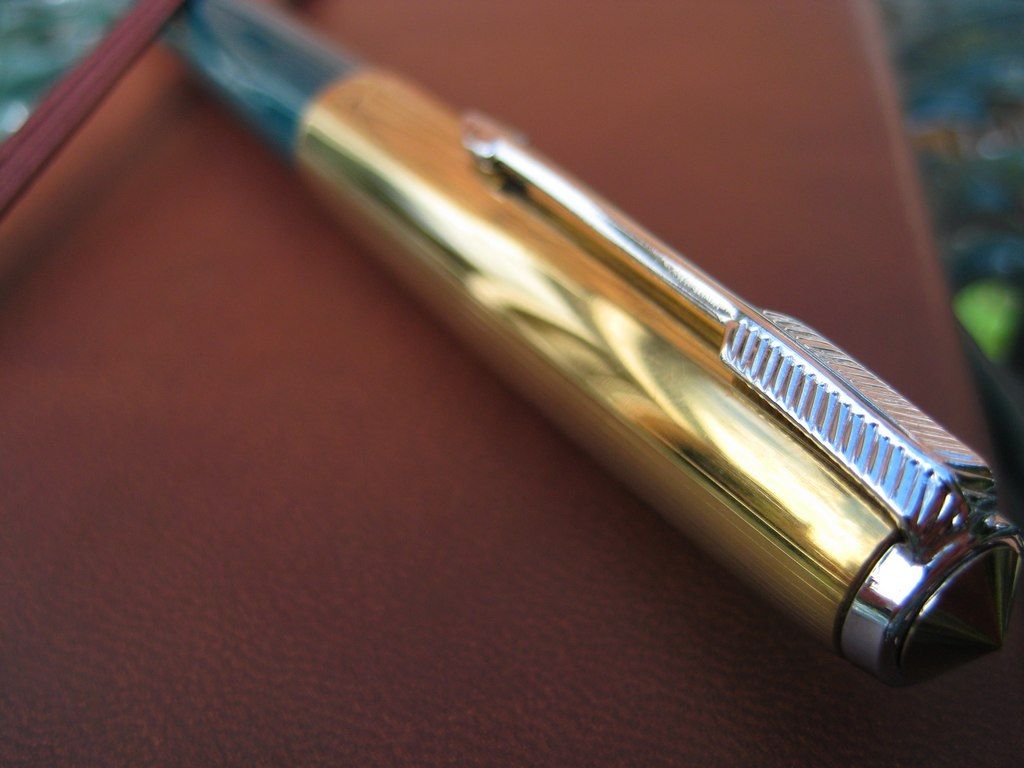 |
| The engraved line pattern and position of the band text is slightly different on the gold cap, I notice. |
 |
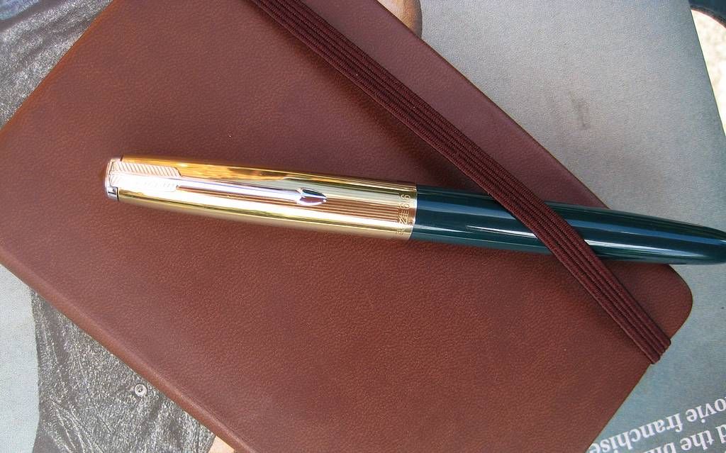
| I shouldn't like this, but I do. The contrast is great. I like the idea of a workhorse pen that looks this eccentric. |
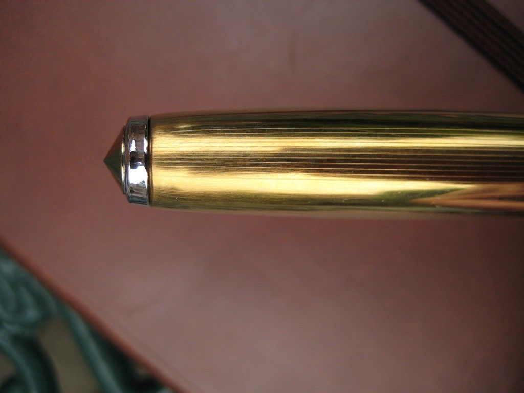 |
| It sort of works, doesn't it? Perhaps because of the slight satin quality to the gold colour of the cap body. |
|
While I'm on the subject of caps, I'm in the market for a
silver Parker 51 cap. I don't hold out much hope finding one, but you never know your luck.
Till next time,
Flounder
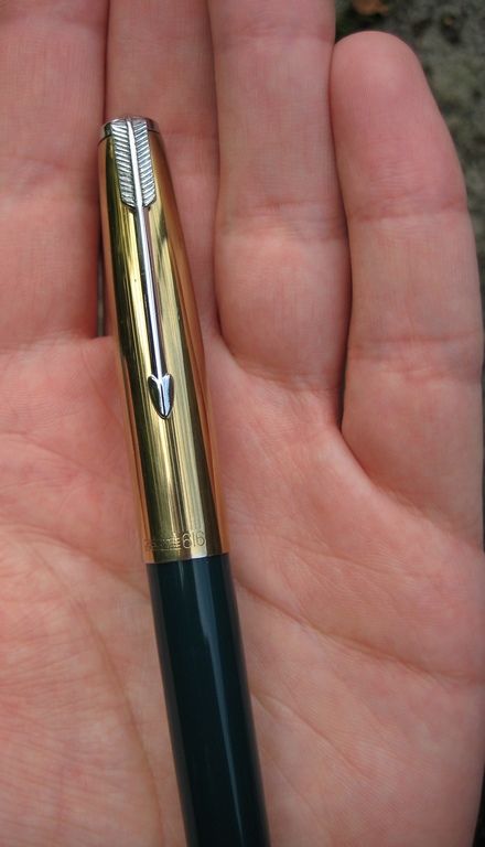
One of the reasons I like Parker's "Flighter" trim so much is the gold-over-silver(y) arrangement of components. I'm not sure I like this inversion of it as much, but I certainly like it.
ReplyDelete...subject to misgivings regarding the 616, as you've seen and commented upon, of course.
One of the reasons I like Parker's "Flighter" trim so much is the gold-over-silver(y) arrangement of components. I'm not sure I like this inversion of it as much, but I certainly like it.
ReplyDelete...subject to misgivings regarding the 616, as you've seen and commented upon, of course.