What's up with demonstrators?
 |
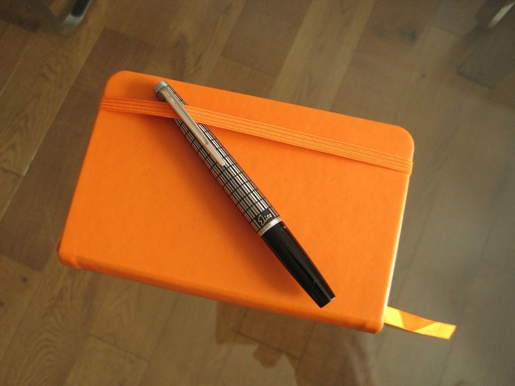
The steel Lucky nib and chrome trim demonstrator cap
paired with the Pilot pen. They also complement the
silver nib size sticker on the barrel. |
Recently, I reviewed a Lucky 659 fountain pen (a Chinese clone of the Pilot 78G). While it has some interesting elements, the gestalt is less than the sum of its parts (details in the
review over at the fountainpennetwork). I’ve dropped the best - the cap and nib – into my 78G.
This let me ditch the Pilot 78G’s showy gold plated nib,
clip and painted cap trim in favour of a tasteful chrome and
steel combo not offered in the original range, and a little more in sync
with the 78G’s functional appeal as a capable and inexpensive
entry-level fountain pen.
 |
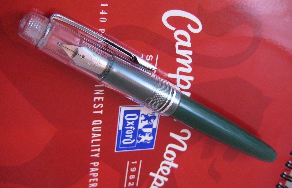
The Japanese Pilot 78G (green) and
Chinese Lucky 659 (clear demonstrator)
side by side. |
In doing so, I was struck by the agreeable change in aesthetic brought on
by the opaque body, transparent cap mash-up, and started to write this
post in the hope of articulating the cascade of questions currently
besetting my synapses like the bulls of Bashan.
Firstly, a brief, baseless background on demonstrator pens, stated with all the authority of an internet eqipped dilettante who's done some light reading in sporadic bursts a while back. Demonstrator fountain pens started off as sales aide. Transparent plastics helped show off the particular features, capacities and workings of the model, which were often an important means of product differentiation before cheap ballpoints radically changed the focus of the writing instrument sector. These demonstrators were
not made generally available to the customer, and vintage demonstrators command a premium today due to this exclusivity .
Modern demonstrators show off the internals in the same way, but form part of the model line included with the range of opaque and translucent colours, often as limited editions. Examples include the clear Pelikan M1000, Pilot 823, or Onoto Magna.
Well, here's my hangup: Of the demonstrator pens you can think of, are there any where the cap alone plays the demonstrative rôle? I'm struggling to think of any. A google search dredged up only
this Montblanc, but even then the owner questioned whether the cap ever belonged to the pen.
 |
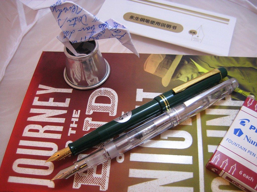
The Lucky cap on the Pilot, before its
gold plated nib was swapped out. |
This state of affairs is a surprise! Take the case of the Montblanc mentioned above. What a fantastic way to showcase the nib! Additionally, isn't it refreshing to see the unbroken line of the pen's comfortable cigar shape?
To achieve a similar effect, many pens are designed with a step between section and barrel, so that the cap is flush while the pen is not in use; in so doing, uncapped appearance and tactile writing comfort are sacrificed. In my opinion, this compromise can range from the acceptable to the perfectly foul (modern
Esterbrook J).
So... why has the cap-demonstrator never taken off? There seems to be an unwritten rule against them, fixed as the laws of the Persians and Medes. Most pens at rest flaunt surface, finish and adornment, the clip
typically being the visual focal point.
Why not eschew the
decorations and make a feature of the business end - the nib itself? On function-centric brands like Franklin Christoph, I feel clear caps would make for a great signature look, advertising those Masuyama-tailored nibs and complementing their classically lathed bodies very well.
While I'm pontificating, for the most part even conventional demonstrator pens aren't fitted with clear inner caps. Very few lend an unobstructed view of the nib. The reasons I've seen cited for this are a) to hide any messy-looking nib creep or cap venting, and b) to prevent sunlight from drying out the nib.
But doesn't that messy-look charge apply
equally - or rather, far more - to a conventional demonstrator's section? An ink
saturated feed is hardly the cleanest looking thing; if anything it
flaunts messiness.
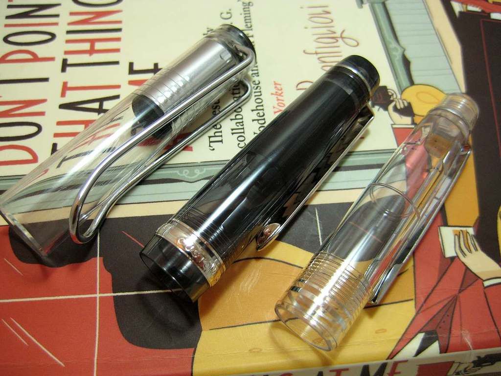
 |
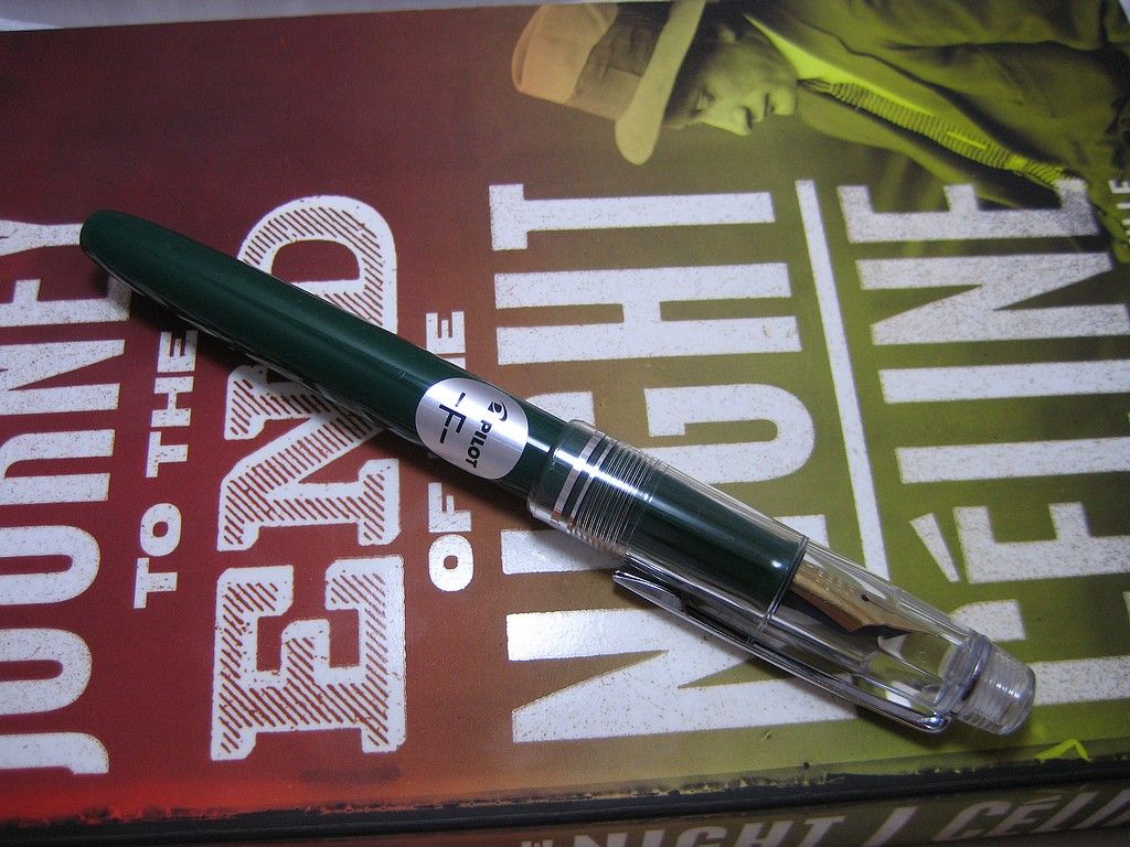
Caps from full-demonstrator pens:
Lamy Vista, Pilot Custom Heritage 92
(well.. smoke rather than clear), Lucky 659. |
As for sunlight drying out the ink, it seems unlikely. After all, there are plenty of demonstrators with transparent barrels through which the ink level can be seen. I've observed no ill effects in the last month using this Pilot/Lucky combo - though this is of course evidence of one, and admittedly Scotland at the end of March is not an environment likely to beam Ra's wrath through a transparent cap!
Do you too wish to voice a scantily researched, ill-qualified opinion on this matter? Post a comment below!